

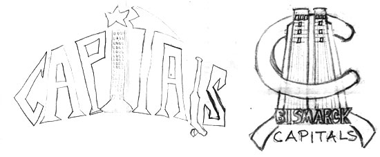
The client provided me with two logo sketches from booster members. Both incorporated the state capitol as an element.
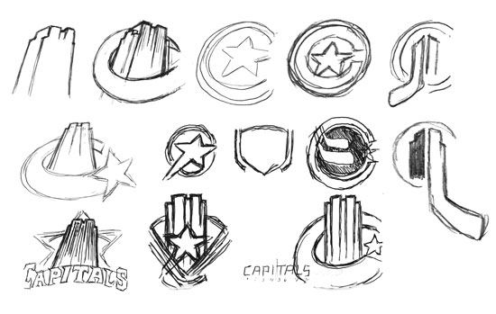
Keeping the client’s input in mind, I attempted to incorporate some of the board’s imagery into the logo. The symbolic imagery of a star in a circle denoting a capital city on a map, was a recurring theme.
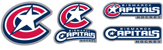
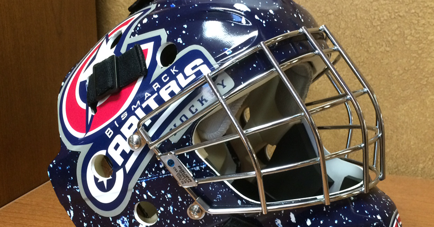
The finished identity set incorporates layout and type combinations for different branding applications on merchandise.
Power Play: Capitals Hockey Logo
The Bismarck Hockey Boosters approached me about redesigning the primary identity for all their hockey operations from PeeWee to Bantam. They were looking for a bold, timeless update to brand their player uniforms and merchandise.
The client submitted to me a couple sketches that were completed by booster board members, so already they had some preconceived ideas as to what they wanted to see.
I tried to incorporate the state capitol building in a few early concepts, but they were all dropped in favor of a more dramatic variation of the familiar map icon representing the capital city.
Recent Comments