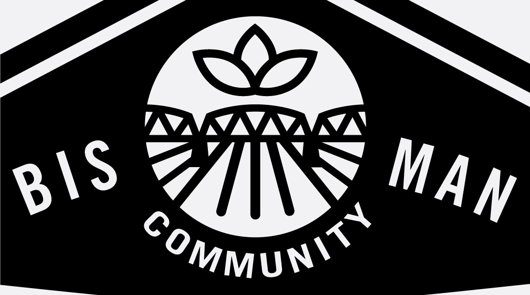
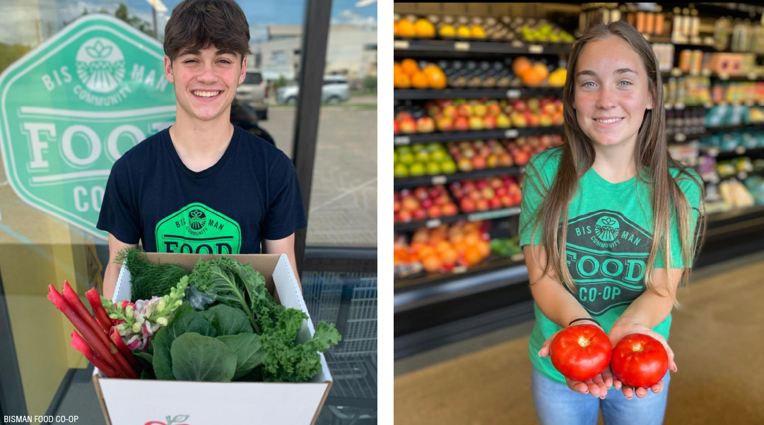
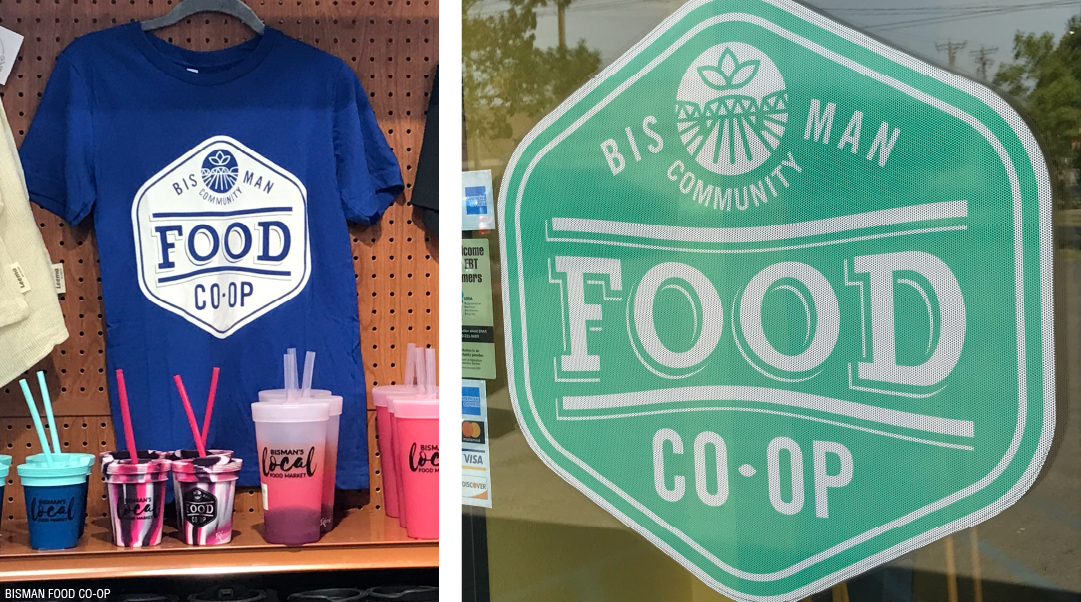
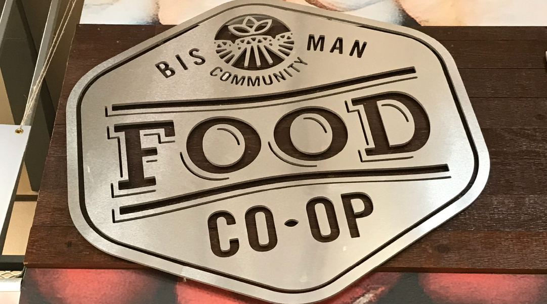
When creating the Bis-Man Community Food Co-op identity, my goal was to keep the emphasis on the cooperative nature of this local food outlet. The symmetrical badge shape was a nod to more utilitarian symbols often associated with agricultural co-ops. The bright green communicates wholesomeness, health-conscious and organic. I chose to symbolize the railroad bridge that spans the Missouri connecting the two communities of Bismarck and Mandan as a way to reinforce the local ties with a bundle of leaves above representing home-grown produce.
