
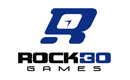
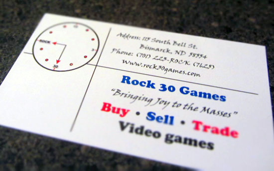
The client’s original business card visually depicted the ‘time’ Rock:30 in the logo. I maintained that story element in the new identity by including the clock hands in the R’s counter.
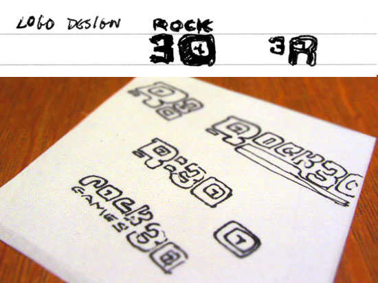
Aside from the initial chicken scratches during my meeting with the client, the concept for Rock 30’s identity was, believe it or not, born on a cocktail napkin.
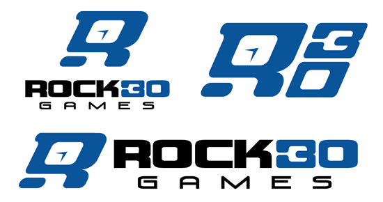
The Rock 30 identity was designed to be modular. An alternate R30 tag was created for merchandising and branding.
Time to Rock
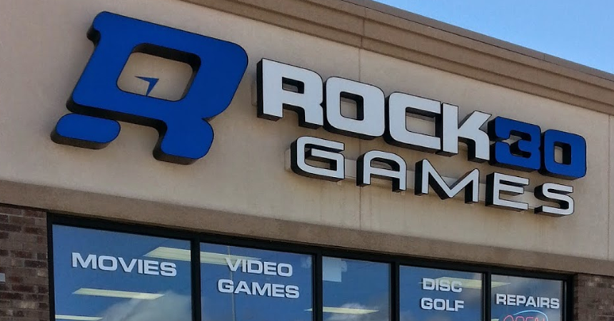
Rock30 Games was originally started by a group of high school friends who spent time playing video games together. It has now grown into an impressive franchise with six locations within the state. I learned that the name of the business referred to that generic time whenever these friends got together to ‘game’. I knew the identity needed to reflect a digital tech kind of fun, so I created some customized typefaces to create a memorable brand.
Recent Comments