

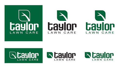
Modularity was key, knowing that the client would have multiple applications for his brand. These comps show the flexibility of different layouts and limited color.
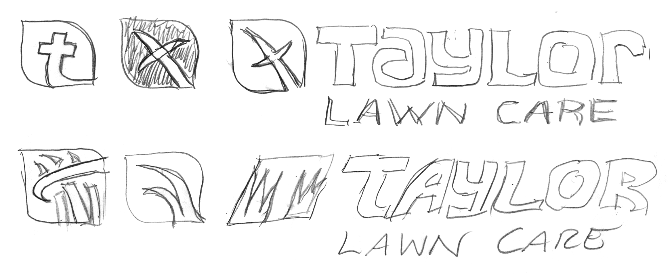
The thumbnails show my attempt at using blades of grass to depict a lowercase ‘t’ for Taylor.
Growing a Small Business Brand
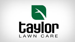
The client was looking for an established and professional look for his lawn care business. My initial goal was to work the ‘T’ of his last name into a bold icon that visually tied into the green grass of a well kept lawn. The limited color scheme seemed logical, but I struggled with how to depict the letter, without it looking too much like a letter. The end result took the form of an abstract leaf, but the original intent was for the negative space to represent a lowercase letter ‘t’.
Recent Comments