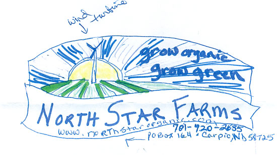
As indicated in this provided sketch, the client had some strong opinions on how they wanted the logo to appear.
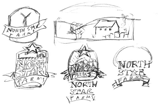
I had some original visions that made the logo taller with more emphasis on the North Star but to no avail.
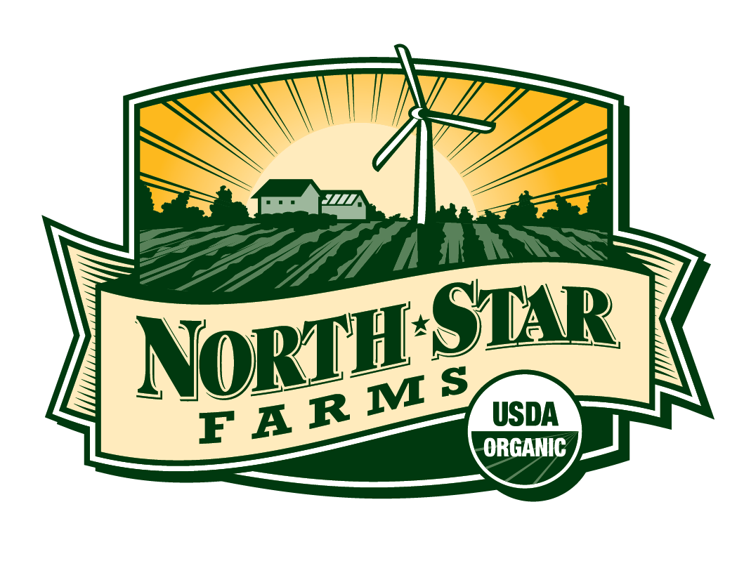
Homegrown Organic Identity
I’m usually hesitant when working with clients that have preconceived ideas as to what their logo should be, but often times I see it as a way to challenge myself and educate the client. North Star Farms was looking for a specific identity for their organic farm in Carpio, ND. One of the items that they wanted to emphasize was the farmstead itself – in particular a wind turbine that powers many of the outbuildings on their acreage. All in all, I felt the detailed style of illustration was appropriate to push this brand as traditional and established.
Recent Comments