It’s the annual football match-up for all the marbles – the National Football League’s NFC-AFC Championship Game; the Super Bowl. Part of the excitement behind this event is the marketing and advertising surrounding it. Many years the commercials are the MVPs, but what always intrigued me was the Super Bowl logo design. Every year a custom-designed logo is created for the event – usually incorporating elements that relate to the locale of the game. Not anymore. Beginning next year the logo will be standardized. The focus of the logo will be the infamous Lombardi Trophy with the locale’s stadium as the background. Beneath the logo will be the words ‘Super Bowl’ and the roman numerals counting off the contests. I’m not sure why the NFL decided to water down their main event in this way, but without the individual expression of the event it’s no longer as ‘super’ as it used to be.


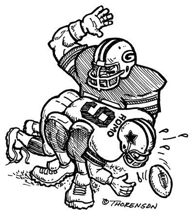
 My oldest son, Mason, is a devout Bears fan (I think he still is) so Sunday afternoon’s Vikings – Bears game was a must watch. “Just-like-a-car-wreck” must watch. After several fits of anger followed by tears, we had to remove him from the game all together. We all knew the Bears were going to eat it, except Mason. I certainly don’t worship football, but I do claim to be a Packer Backer. One thing I will freely admit, is that Favre, even wearing the Purple and Gold, is still fun to watch. For 16 seasons he pulled a lot of the same stunts for the Pack and now he’s doing it for <ughh> their chief rival. Minnesota sure looks tough this year and the kid in me (the one that used to like the Vikes growing up) wants to see them make it all the way to the Super Bowl.